Proven Strategies To Reduce Shopping Cart Abandonment
“I really don’t want to make more sales from the visitors that are already browsing my online store”, said no eCommerce owner ever.
More revenue from the people that you’ve already attracted to your website? Sounds like a dream, right?
Well, assuming you take the right steps to optimize your online store, it’s certainly possible.
Here’s the thing. Shopping cart abandonment is the reason for about $4 trillion worth of lost sales globally, and your store is part of that statistic, whether you’re aware of it or not.
In this guide, we’ll dive into the reasons behind cart abandonment, the formula to calculate your store’s abandonment rate and actionable tips to reduce it.
What is shopping cart abandonment and why does it matter?
Shopping cart abandonment occurs when a website visitor adds items into their virtual basket and starts the checkout process, only to then leave the website without completing the purchase.
When it comes to your approach to shopping cart abandonment, there are a few things to keep in mind.
Firstly, the bad news:You simply can’t afford to ignore cart abandonment in your online store.
While you won’t be able to prevent all of it, cart abandonment is a sign that there are parts of your checkout process that need fixing.
When your cart abandonment rate is high, it’s a sign that your potential customers start their purchase journey, but get interrupted or discouraged to complete it.
In other words, it means that you’re losing customers and lowering your profit margin.
The good news? Even the slightest improvement can yield great results, and not just once, but month after month.
Let’s say your online store currently attracts 100,000 visitors each month and they spend $120 on average.
Now let’s imagine you have a conversion rate of 0.5%, meaning that one out of every 200 visitors become a customer. Right now, that’s 500 sales every month that bring you $60,000.
If you could increase your conversion rate by even 0.1%, you’d bring an extra $12,000 in revenue each month.
That’s $144,000 annual increase, all from a few recommended changes that we’ve outlined below.
How many shopping carts are abandoned?
There have been many studies trying to answer that exact question.
In fact, a 2017 study by Barilliance revealed the global abandonment rate of 78.65%, rising slightly from 77.24% the year before.
If your rate is anywhere near this, it means that more than ¾ of your shoppers choose to leave your site instead of completing their purchase.
Data from Statista also revealed a growth in shopping cart abandonment rate, jumping by almost 10% from 2006 to 2017:
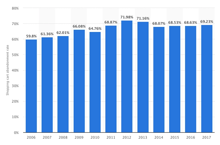
The trend is clear. The challenge of cart abandonment isn’t going anywhere.
Shopping cart abandonment rate by industry.
So, what do these numbers mean based on your industry?
Potentially, a lot.
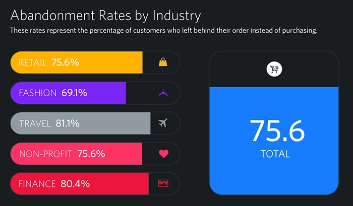
According to a SaleCycle study from early 2018, travel and finance have some of the highest cart abandonment rates; more than 80% of customers in these areas leave their carts behind.
On the flip-side, online fashion retailers seem to enjoy one of the lowest cart abandonment rates:
Why is it important to keep these very different benchmarks in mind?
When you think about the nature of these industries, it makes a lot of sense.
Fashion retailers have the benefit of the simplicity of returns, faster purchase decisions, and a cleaner purchase journey on mobile. As it turns out, fashion retailers outperform other sectors when it comes to converting mobile traffic into mobile sales.
In comparison, travel is a high-ticket sector where prices fluctuate a lot, so it’s not surprising to see such a high cart abandonment rate. It’s a byproduct of the way people conduct price comparison.
The takeaway? Don’t disregard the way your industry affects the purchase process your customers go through.
How to calculate your shopping cart abandonment rate.
Now that you have some benchmarks, here’s how you can calculate your own cart abandonment rate so you can understand where you are compared to others.
The shopping cart abandonment rate formula is:
(1 – number of complete purchases / number of shopping carts created ) / 100=shopping cart abandonment rate
More specifically, the cart abandonment rate is calculated by dividing the total number of purchases by the number of shopping carts created. Subtract that number from one, then multiply by 100.
Let’s say you have 35 completed purchases and 160 shopping carts created. When you add these to the formula, you get:
( 1 – 35 / 160 ) x 100=78.13%
Remember that your cart abandonment rate will fluctuate, so make sure to track it regularly.
Top reasons shoppers abandon their carts.
In order to reduce cart abandonment for your online store, there are two fundamentals to keep in mind:
1. Understanding the reasons for shopping cart abandonment is the key to preventing it
2. Some degree of cart abandonment is unavoidable
Cart abandonment will always happen, regardless of what you do, meaning you’ll never bring your cart abandonment rate to zero.
It’s simply the way some people browse and conduct research, and sometimes they just get interrupted.
In fact, almost 60% of US online shoppers abandoned their carts simply because they were ‘just browsing’ and weren’t ready to buy—so don’t get discouraged by a high cart abandonment rate.
Instead, focus on the things you can influence by taking dedicated action in your online store strategy.
According to various reports, including the ones from Baymard Institute and Statista, the main reasons shoppers abandon their carts are:
- Shipping and other costs (fees, taxes) are too high
- The site asked them to create a new account
- The checkout process is too long or complicated
- Not trusting the site with credit cart information
- Delivery takes too long and/or no express shipping available
- Not able to find a discount code
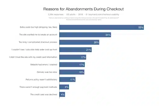
These reasons reveal an important insight:shoppers want to buy in a transparent, efficient, convenient way.
They want painless delivery time and a safe way to enter their payment details. They don’t want the shock of extra costs at the checkout, or the frustration of re-entering their information.
To make your visitors’ purchase experience a breeze and reduce your cart abandonment rate, follow the steps below.
Practical steps for reducing cart abandonment.
You might already have some of these strategies in place, but it’s worth reviewing them all to ensure your cart abandonment rate is kept at a minimum.
Eliminate checkout surprises by displaying shipping costs and conditions as early as possible.
Let’s be honest. Free shipping is likely to remedy much of the shopping cart abandonment issue.
There’s something about paying for shipping that makes people leave their entire shopping carts behind.
So, if you can offer free shipping on all orders, go for it.
After all, if it is financially viable to do so, it’s the best step you can take.
If it’s not something you can afford to do for all purchases, we would recommend having a spending threshold so that customers who spend over a certain amount are eligible for free delivery.
If you absolutely have to charge for shipping, choose a flat shipping rate or a simple and transparent shipping rate tier.
More importantly, make the details of shipping costs and timeliness clear on every relevant page, including:
- The top bar of the entire website
- Product and checkout pages
- The FAQ page
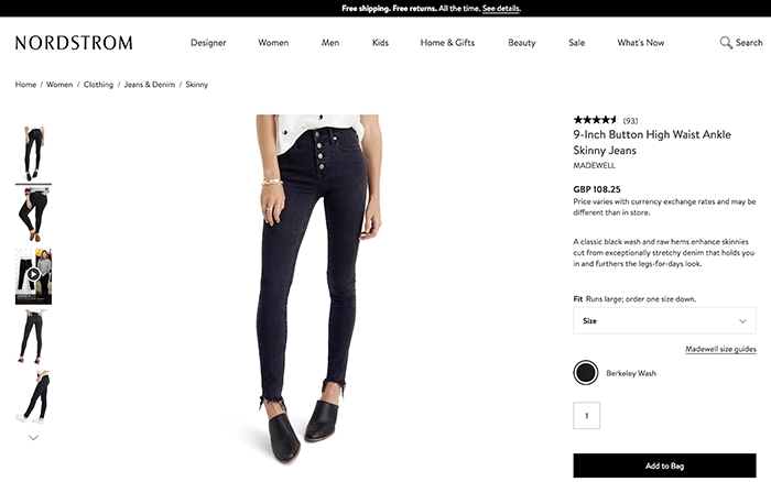
Nordstrom is a good example of a retailer that offers free shipping and makes it clear across its website:
Alternatively, home decor store, Z Gallerie, offers free shipping on orders of $49 and more. This is how the brand displays it on its product pages, along with an ongoing discount:
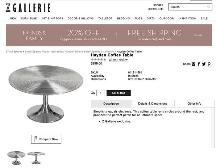
With these solutions in place, your customers will know their shipping costs right away, which will eliminate any such surprises at checkout and prevent cart abandonment.
Keep the shopping cart obvious and visible during browsing.
How many times have you conducted all of your research around the product, added it to your cart with the intention of buying it, and then… forgot about it?
If there is no visual cue to remind your visitor they’ve kicked off the purchase process, there’s a chance you’ll lose them in case they get distracted.
You can add a non-intrusive reminder of your visitor’s intentions by adding some of the following visual triggers:
- A pop-up screen of the added item after it’s added to the cart
- A number next to the cart icon that implies there are items in the cart
- A drop-down menu of the cart with product thumbnails visible during browsing
Asos displays the product in the cart after it’s added as shown on the screenshot below, after which you can see a number of items in the cart at all times:
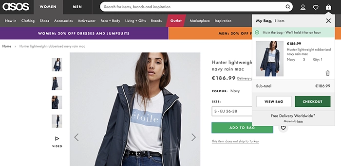
As a bonus, you can nudge your shoppers to save their cart or add items to the wishlist so that they can easily complete the purchase when they return. This way, true distractions won’t make them afraid of losing the entire cart.
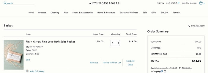
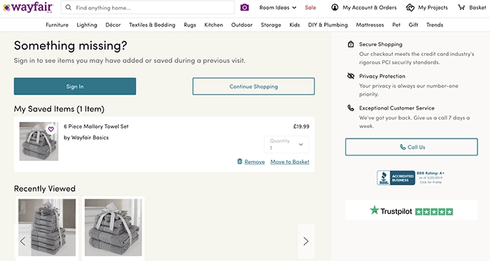
Online stores like Anthropologie and Wayfair offer options to add items to the wishlist and allow users to do so without registering—although they use the opportunity to nudge them to do so:
Reduce the number of pages and steps that lead to checkout.
Some of the recurring customer objections when it comes to completing their purchase are about:
- Asking for “seemingly unnecessary” customer information
- Having to log in to create an account
- Confusing next steps at checkout
In other words, customers just want to be able to checkout quickly, reliably and without having to remember another password.
With this in mind, here are some steps you can take to optimize your checkout process and remove friction:
- Use a minimum number of pages that lead to the checkout
- Use a minimum number of form fields that need to be filled out
- Provide options for checking out such as a guest checkout, the option to login with an existing account, or the option to create a new account
- Make the call-to-action button the obvious next action
One of the best examples of a simple, streamlined checkout page comes from Bellroy:
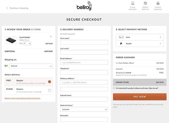
This page makes it easy to review the order, choose the right shipping option and be confident about the purchase choices made.
Trusted payment options.
We want our payment information to be secure. It’s as simple as that.
It’s no surprise that one study revealed that 61% of people won’t make a purchase if they don’t see a trust logo. The same is true for the 75% of those that don’t recognize the logo.
In other words, trust badges (or trust seals), that support the secure payment processing are an important element of high-converting product and checkout pages.
A great example of an eCommerce site using trust badges is MyBinding store.
In fact, alongside the permanent Norton badge at the bottom left corner of the screen, it also lists these trust badges at the bottom of its website.
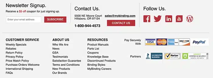
Beyond the security badges, a surefire way to raise your online store’s credibility is by having a valid SSL certificate. It makes it easy for you to encrypt and protect sensitive customer data.
Having an SSL certificate isn’t just a nice-to-have though.
Why?
Because Google will flag any site that doesn’t have one as not being secure, informing potential customers that their sensitive information isn’t safe.
Not ideal when there’s a payment transaction involved.
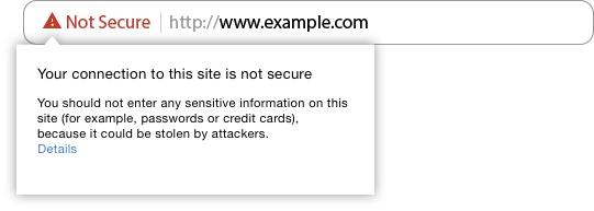
This highlights just how important it is to ensure that your online store’s security measures are in place – and that your customers can see them.
Make getting in touch easy.
It can’t be ignored that potential customers may have questions prior to purchasing your items, whether it be about sizing, delivery, your returns policy or so on.
The problem is, these buyers won’t wait long for an answer.
In fact, even if you have a dedicated email for customer support, without other means of more accessible customer service, you risk losing shoppers at the final hurdle.
So, what are your options?
Well, in an ideal world you would have live chat functionality on your site, available on each page of your online store.
Online shoe retailer, Zappos, is a perfect example of an eCommerce store using this approach.
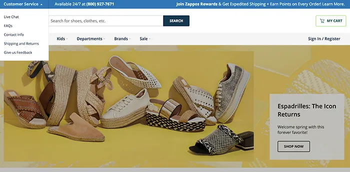
Zappos not only makes 24/7 customer support obvious throughout its entire website, but it also shares its phone number right away, along with a menu that leads to live chat, other contact information, and frequently needed details such as shipping and returns.
Even if 24/7 customer support isn’t a viable options, it’s still important that you’re making your customer support number available across the site.
If email really is the only feasible solution, make sure you’re managing expectations. Provide clear customer support hours and the average response times, and make sure you stick to them.
Take action to reduce shopping cart abandonment.
The bottom line is, you can’t get rid of cart abandonment altogether.
Why?
Because no matter how hard you try, you can’t control other people’s actions or circumstances.
That said, by minimizing any friction and making the improvements suggested above, you stand to encourage more visitors to complete their purchases, while further encouraging repeat custom.