Abandoned Cart Emails: Template, Best Practices, Examples and Tools
Here’s the cold, hard truth: out of the 100 people that visit your online store, only one or two people on average end up buying something.
In fact, most eCommerce businesses aim for a baseline conversion rate of 2% and are happy when they achieve it – and rightfully so.
But what if that number could be higher? What if you could convert more customers, starting with those who make it to the checkout only to leave before buying?
Winning the attention and trust it takes to convert a website visitor into a customer takes time and effort, but there is a way to recover sales you otherwise considered lost.
How?
With abandoned cart emails.
With the right message and timing, abandoned cart emails can generate a $5.64 revenue per email sent, compared to only $0.02 for promotional emails and $0.18 per welcome email.
Now when you consider that 75% of all shopping carts are abandoned, this strategy is a no-brainer.
In this guide, we’re taking you through abandoned cart best practices, examples from other retailers, and the tools you’ll need.
We’re also giving you an abandoned card email template so you can get started right away.
Short on time? The links below will take you straight to each section!
- What are abandoned emails in eCommerce?
- Why do cart abandonment emails perform so well?
- The reasons buyers abandon their shopping carts
- Abandoned cart email best practices and examples
- Abandoned cart email subject lines
- Abandoned cart email template
What are abandoned emails in eCommerce?
Abandoned cart emails are automated emails sent to your eCommerce website visitors after adding one or more products to their cart, but failing to check out and complete their purchase.
This email serves as a timely reminder for the shopper—ideally within 24 hours—that they can easily return and buy the items they liked, hassle-free.
According to the usage data that Moosend analysed, here is how cart abandonment emails perform from the moment they’re sent until they convert the visitor into a customer:
- 45% of all cart abandonment emails were opened
- Out of the opened emails, 21% clicked-through to their shopping cart
- Off these, 50% of users purchased
In real life, this might look something like the following:
Each month, 1,000 people kick off their checkout process but drop off before completing their purchase – so you nudge them to come back and do so with a cart abandonment email.
Of all recipients, 450 people open the email.
Of all the people who opened it, 94 people clicked through to their shopping cart.
Perhaps more importantly, 47 people went on to complete their purchase.
That’s 47 people who may not have come back. Even worse – they could’ve gone to your competitor.
If we take the average order value of $114, this means you’ve now recovered more than $5,300.
Which brings up the next logical question:
Why do abandoned cart emails perform so well?
Unlike standard promotional emails targeted at a broader group of customers – past or potential – cart abandonment emails are only sent to people who have shown a high interest in your items.
Not a week or month ago, but today or yesterday.
This makes them more purchase-driven than a casual visitor and therefore more likely to open the email, click through and complete their purchase.
Furthermore, successful abandoned cart emails are also:
- Hyper-tailored to the recipient: beyond the standard ‘Hi Name’ personalisation, they feel like an individual wrote them thanks to their product-specific nature.
- Focused on a single goal: they don’t aim to promote multiple or random products or categories, instead they focus on getting the user to come back exactly where they left off.
- Scalable: you have to do the majority of the work upfront rather than at the time, thanks to automation.
To make the most of your abandoned cart emails, it’s crucial to understand why cart abandonment happens in the first place.
Top reasons shopping cart abandonment occurs.
If your checkout process is broken, your cart abandonment emails won’t bring you the results you’re looking for.
It’s therefore important to understand why your potential customers might be leaving in the first place, instead of simply setting up your cart abandonment automations and calling it a day.
Barilliance have listed and prioritized top reasons for cart abandonment based on two leading studies. Some of the key reasons include:
- Unexpected cost of shipping
- Having to create a new account
- Long and confusing checkout process
- Simply conducting research
- Payments:lack of options and/or concerns about security
- Couldn’t find a coupon code
- Slow delivery, no express shipping
Below, we have outlined some of the critical steps to take so you can minimize cart abandonment for the above reasons.
Display shipping costs early and offer free shipping if you can.
If your profit margins allow for it, give your customers a free shipping option. Many retailers offer it with a minimum spend threshold and some offer it for all orders.
If any of the two apply to you, make sure it’s visible on every page of your online store.
This way, the shopper knows how much to spend to qualify.
On top of that, make further shipping cost information easily available, for example from the bottom menu.
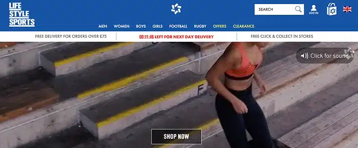
You can see a great example of a free shipping threshold on Life Style Sports.
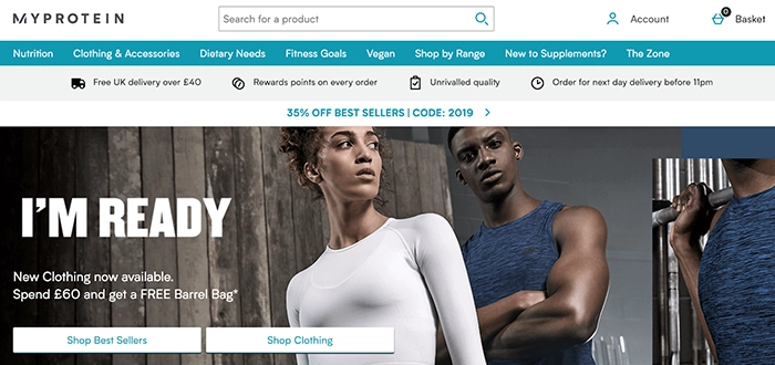
MyProtein applies this well, too.
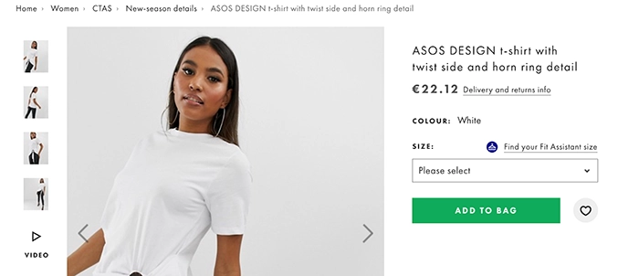
And if your shipping tiers are more complex than the minimum spend (for example:standard, next day, and nominated day delivery), add a link to all your products that leads to detailed information, just like ASOS did:
Reduce the number of steps needed to check out.
Having to create an account and jumping between various checkout steps are frequent reasons shoppers abandon their carts.
To minimize the friction, enable your shoppers to check out by only entering their email address. Then, provide a full checkout process on a single page, eliminating back or forward buttons.
Sephora’s checkout page is a brilliant example of these techniques:
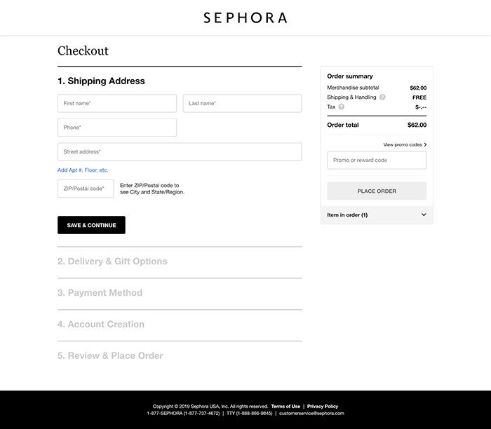
Bonus note: Sephora also removed all navigation from the top, further reducing the chance for the customer to drop off while checking out.
Make your coupon codes visible from every page.
This is a simple issue that’s easy to tackle.
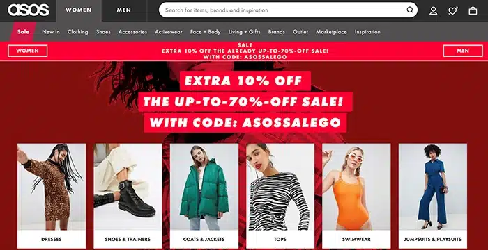
If you have a site-wide discount code, make it obvious at all times by adding a bar at the top that displays it clearly.
ASOS nailed it again with a red bar below their main menu:
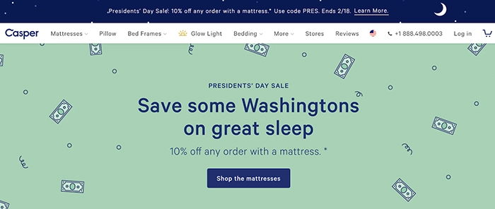
It’s also worth considering holidays and national events, as this adds a sense of urgency. As an example, online retailer, Casper, added their Presidents’ Day code above the entire site’s content:
Infuse security with trusted payment options.
The more payment options you offer and the more secure your payment processors are, the better your chance of converting a casual visitor into a shopper.
There’s an obvious solution of offering the most frequently expected payment options—PayPal, card payments (Visa, AmEx, Maestro, MasterCard), and more recently Apple Pay, Google Pay, and Amazon Pay.
Beyond that, make your security badges and verifications, along with payment options you offer, obvious. Here’s an example from the footer on New Look’s online store, which includes security badges from MasterCard and Visa:

Abandoned cart emails: best practices with examples.
After laying a strong foundation, it’s time to go over elements that make cart abandonment emails stand out and recover lost revenue.
Abandoned cart email subject lines.
Remember the 45% open rate on abandoned cart emails we mentioned earlier? It’s even more impressive when you take into consideration the average 15% email open rate for the eCommerce sector.
To get closer to 45% than 15%, make your abandoned cart email obvious through its subject line.
Some generic, but crisp and attractive examples of subject lines you can use are:
- We saved your cart for you
- You left something in your cart
- Complete your [shop name] order today
- Your cart is waiting for you
- Patiently waiting in your shopping cart
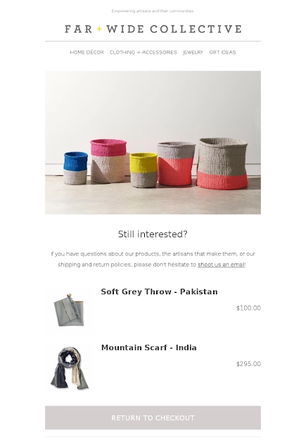
A great example comes from Far + Wide Collective, who used the ‘Your cart is waiting for you’ subject line and clearly listed the items left in the shopping basket with a ‘Return to checkout’ call-to-action button.
You can also use discounts and limited-time offers to encourage the user to check out—just make sure to make them obvious from your email subject line.
Examples from retailers include:
- Kate Spade: Enjoy 15% off that special something in your shopping cart
- bareMinerals: We saved your cart + 15% off
- Outdoor Voices: Free Shipping on your cart
Items from the shopping cart.
The next most important element is your presentation of products in your visitor’s cart in the email.
The only rule to follow here is to make the item(s) you’re listing obvious to the recipient. Ideally, they should all be visible before he or she has to scroll down, and it should perfectly resemble the actual cart they’ve left behind, including colors, sizing, and any other variations.
Beyond that, it’s up to you to decide on text versus visuals and any other elements.
Great examples include both.
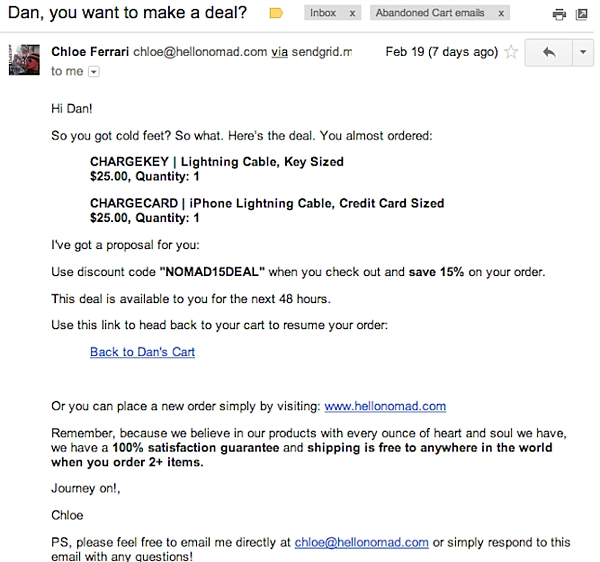
Shopify shared a screenshot from a Hello Nomad cart abandonment email, which only contains text and a couple of links:
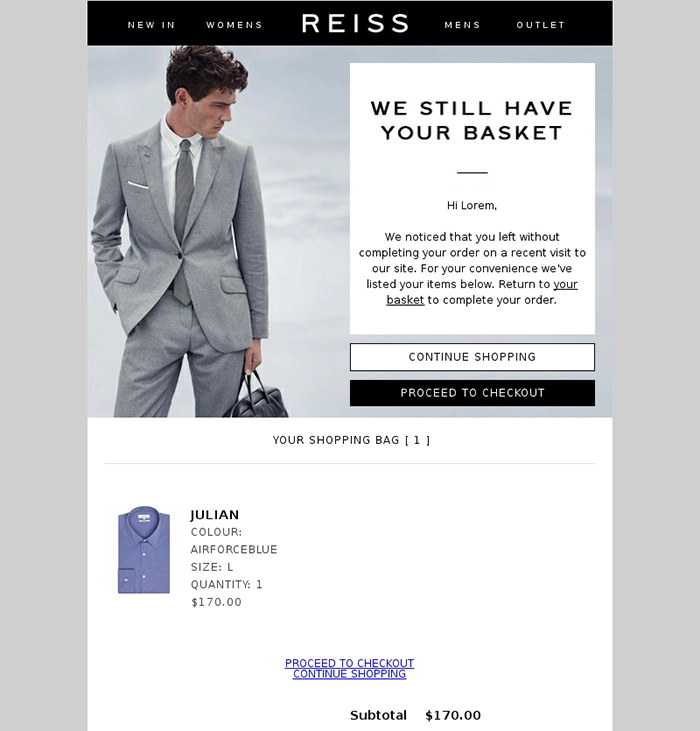
Reiss, however, lists the items in the cart using their image, along with its color, size, quantity and price:
Abandoned cart email copy.
Your abandoned cart email copy has a mission to reinforce the message from the email subject line.
In other words, it should convince your visitor that there’s a good reason to purchase the items they’ve left behind.
In fact, the best abandoned cart emails are short and to the point.
Here are some key elements to include in your email copy.
Immediate clarity.
Begin your email with the main point. This can be a slightly expanded version of the subject line, such as:
‘Hi [name], thanks for checking us out! We noticed you left your cart before completing your purchase. When you’re ready to come back and finish your shopping, here’s a link you can use.’
The fear of missing out (FOMO).
Scarcity is a powerful strategy in emails. From limited quantities to limited time offers, consumers don’t want to miss out on a great deal.
Here are some elements you can include in your copy to play into FOMO:
- Your items are not reserved, so they could sell out – it’s happened before.
- Get your items before it’s too late.
- We’ll keep these items in your cart for the next 48 hours.
- Your cart is safe with us for the next 24 hours!
If you’re offering special discounts or free shipping, here are some ideas:
- Enjoy 15% off your entire purchase if you check out in the next 24 hours.
- We have an offer:use discount code [code] at the checkout and get free shipping with your order. This is available to you for the next 48 hours.
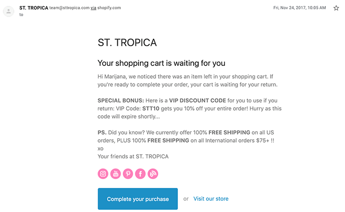
A great example of a limited-time discount code comes from St. Tropica.
Call to action.
The call-to-action (CTA) in your cart abandonment email is a simple, yet crucial element for its success.
The reason is simple:once your email subject line, copy, and listed items have done their job, your CTA is what will explicitly state how to return to the abandoned cart.
Again, the choice between a simple link or a button is entirely your preference based on the overall look and feel of your email.
More importantly, focus on the wording of your call-to-action. Make sure it clearly states what to do to retrieve the shopping cart.
Try some of these examples:
- Restore my cart
- Continue your checkout
- Complete your purchase
- View cart and check out
- Return to basket
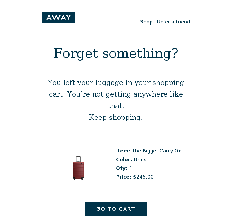
It really is as simple as it looks. A real-life application comes from Away’s abandoned cart email:
Customer support and social proof.
Finally, you can spice up your email by creating more peace of mind for your customer-to-be.
How?
With a guarantee of having their back and by showing that others have trusted you, too.
Here’s how Away have combined these two elements at the bottom of the above-shown email:

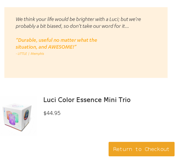
Alternatively, MPOWERD included a customer testimonial:
In other words, let your customers, returns policies, and availability for customers speak for themselves.
Abandoned cart email template.
Ready to create and launch your cart abandonment email?
Below, you’ll find an abandoned cart email template you can simply take and adjust to the specifics of your online store and your preferences.
Subject line (select one of the following):
We saved your cart for you
You left something in your cart
Complete your [shop name] order today
We saved your cart + [discount]% off
Email copy (delete parts that don’t apply to your business);
Hi [name], thanks for checking us out! We noticed you left your cart before completing your purchase.
Here are the products you left in your cart:
[Product One]
[Product Two]
When you’re ready to come back and finish your shopping, use this link to restore your cart and check out.
Your items aren’t reserved and we’d hate for them to sell out! OR We’ll keep these items in your cart for the next [X hours], so make sure you check out by then.
Thanks again for shopping at [shop name]! If you have any questions, you can reach us directly at [phone number] or [email address].
Best,
[Your name]
The tools you need to make abandoned cart emails a reality.
Finally, you’ll need a tool that will enable you to send an email to your shopper who abandoned their cart within a day and do so in a streamlined, automated way.
You’ll find tools ranging from email marketing providers through to add-on conversion optimization tools of all price ranges and capabilities.
These are some initial suggestions for you to check out. Make sure to click through to find out what you need to integrate each tool with your online store:
Start sending abandoned cart emails today.
A cart abandonment email strategy isn’t a quick fix for your online store’s conversion rate. It’s a long-term approach that nurtures your relationship with potential or past customers.
By following these steps and re-engaging those who might be just casually browsing your store, you will reduce the chance of losing a potential sale to a competitor.
Most importantly, by offering transparent and efficient customer support and guarantee in your abandoned cart emails, you will build trust and convey dedication to your customers.